
Nature-Inspired Palettes for Your Home
Sunsets over the Ocean Inspire Home Decor

Whether you’re refreshing your living room decor or preparing for a full-scale renovation, selecting the right color palette can be downright overwhelming.
When I’m looking for design inspiration, I often turn to a home’s surroundings for help. From tropical greens and earthy sand to sky blues and dark charcoal, some of the best color palettes are found right outside your front door.
To help you pick out the perfect combination, I pulled together my top five favorite nature-inspired color palettes that work well together.

Sea Blue, Cream, and Black: Living in Santa Barbara and with the ocean never far, a color palette inspired by the sea is a given. While overly inspired coastal decor is a bit dated these days, pairing soft grayish blues with crisp whites and creams creates an earthy palette without being too literal. As blues are generally considered calming, this is a great palette for bedrooms and one of my go-to recommended color palettes for selling homes. Adding black or dark charcoal brings in depth and dimension and creates a modern feel.
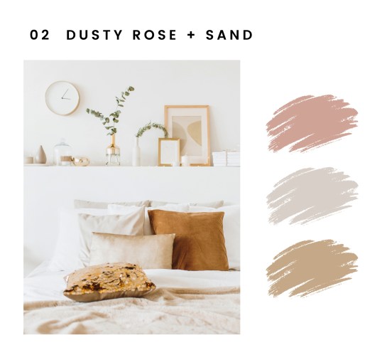
Dusty Rose and Sand: This tone-on-tone combination reminds me of sunsets over the ocean, when the water and sky both turn a pale, dusty rose color and it’s difficult to tell where the water ends and the sky begins. Throw in the color of sand and you’ve got a soft color palette that’s anything from boring.
This color scheme pulls from pink and orange on the color wheel and includes various tints ranging from blush and rose to sand and gold. When using an analogous color scheme, be sure to include a variety of shades and textures for interest, such as knit throws and woven rugs. This feminine palette pairs well with grays and leather for a more balanced feel.

Dark Charcoal, White, and Wood: Dark charcoal and blacks may sound depressing, but when combined with natural light, white paint, and warm wood tones, the colors become very inviting. Many dark charcoal colors have warm undertones, making them a beautiful pairing with wood. This high-contrast palette is softened by the wood tones and complements well with lots of texture and plants for an approachable feel.
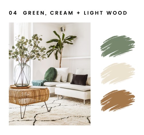
Green, Cream, and Light Wood: Like a walk through a eucalyptus grove, this palette is taken right out of our local preserves. Pairing sage and olive greens with light wood tones creates an earthy vibe, and adding white paint or furniture further creates a bright and airy feel. This palette pairs well with the Scandinavian and boho furniture trends popular today.
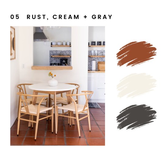
Rust, Cream, and Gray: Whereas this color palette may not pull directly from our local flora and fauna, it certainly is found in the white stucco walls and red tile roofs that dominate downtown Santa Barbara and define so much of the architectural style of our beloved town. And if your home leans Spanish or Mediterranean in style, this earthy color palette is for you. This palette reminds me of the historic adobe homes throughout California and creates a cozy, serene space.
I’d love to see photos of the color palettes in your home! Tag me on social media @vacayrentaldesign.
Christine S. Cowles is the owner of Vacation Rental Design, an interior design company specializing in short-term rental properties. She is a certified Short-Term Rental Stylist™, member of Real Estate Staging Association, and a proud WEV graduate. She can be reached at hello@vacayrentaldesign.com.

You must be logged in to post a comment.